
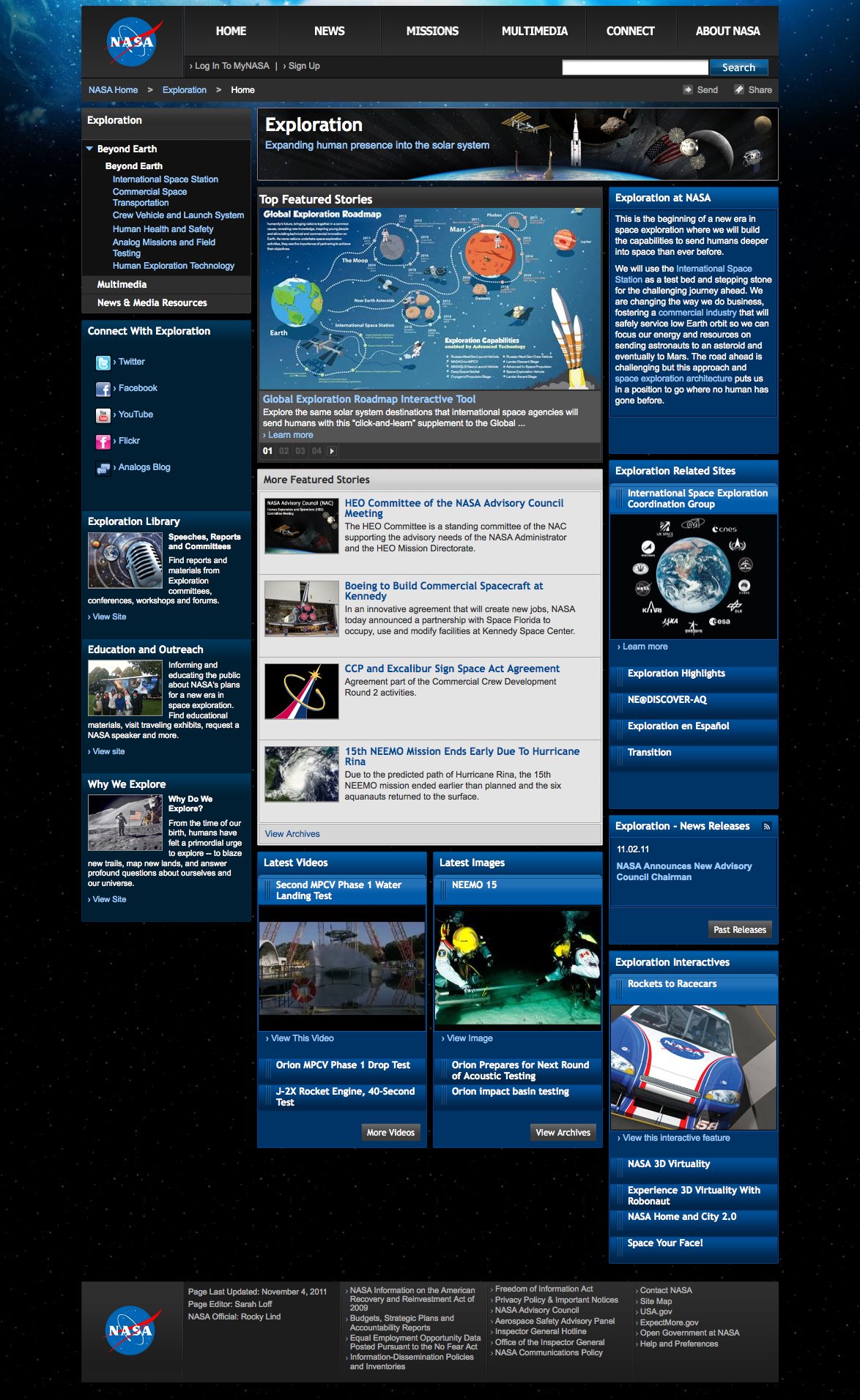
Global Exploration Interactive Infographic
One way of making data approachable is through accessible visualization. The NASA Open Government team partnered with members of the International Space Exploration Coordination Group (ISECG) to produce an infographic for their Global Exploration Roadmap. I led the design team that created the infographic based on space mission data. We sketched, illustrated, and coded all components of the final deliverable.
Influenced by 1950’s Disneyland designs, video game visuals, and Peter Pan Neverland maps, the team hoped to describe the complexity of international space projects with simple highlights. Our jovial approach to the design lead to the idea of making an iPad-compatible interactive infographic. The piece was eventually chosen as a stick pick on visual.ly.
I identified a HTML 5 tool for animating the infographic and created an interactive user experience that was later featured on NASA.gov.